To organize and display large amounts of data created with Deep Analytics, use pivot tables in the online view and the downloadable Excel templates. Pivot tables can show what is important without losing details. In a pivot table, you can change the orientation and grouping of the data, and the hierarchical order of groups and categories. You can use one pivot table to display different kinds of scenarios.
Raw data is stored in the background. If you group data or omit categories in the table or chart display, no data is eliminated, and you can return to display data at any time.
Example 1: Analysis by mailing
Prerequisites: To create the following example pivot tables, you need a Deep Analytics report that contains the measures and groupings as shown on the image. For more information on how to create reports, see Creating a report template.
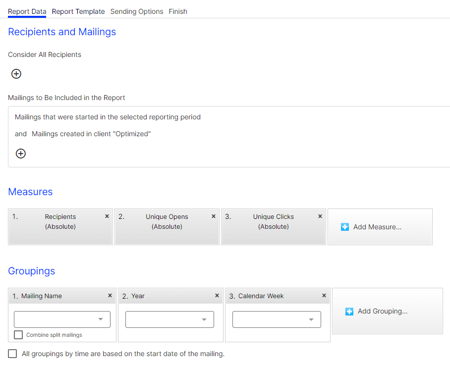
The following examples demonstrate how to use pivot tables for an exact analysis of desired data and details, using different criteria in the same report. By grouping, sorting and omitting data, you can capture reports at a glance. You do not lose any data, though. If you need to show more details, unfold the table and re-order groups and categories.
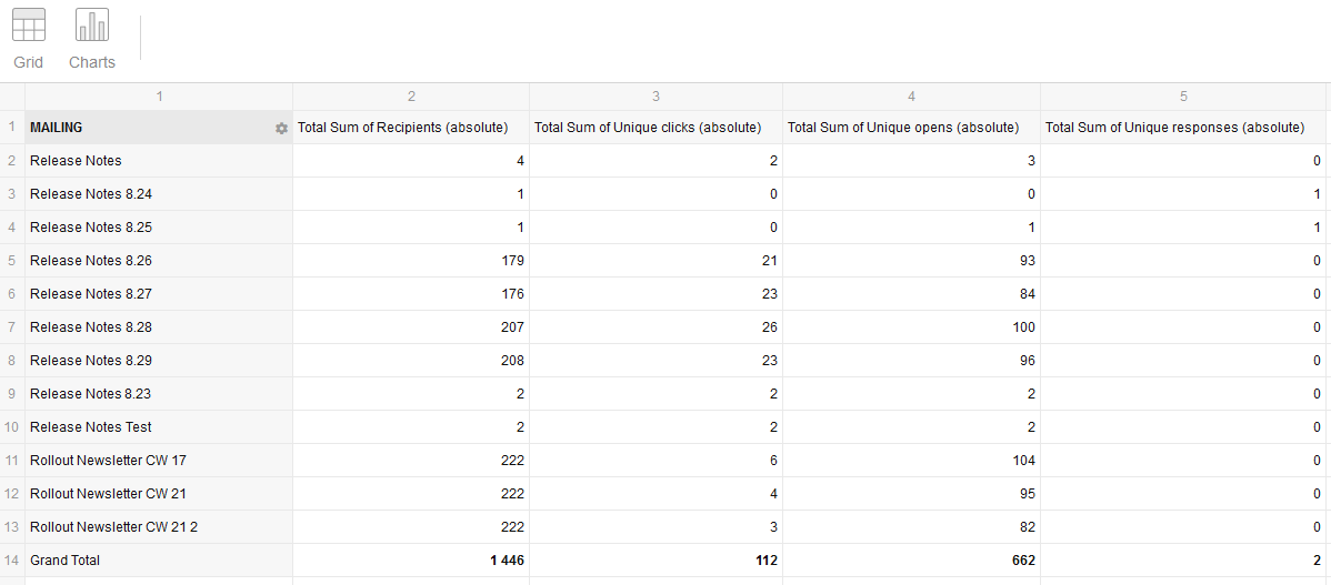
The following image shows an analysis of recipients, clicks, opens, and responses by mailing.
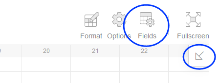
To change or rearrange the pivot table, click Fields or the arrow icon pointing to the bottom left.
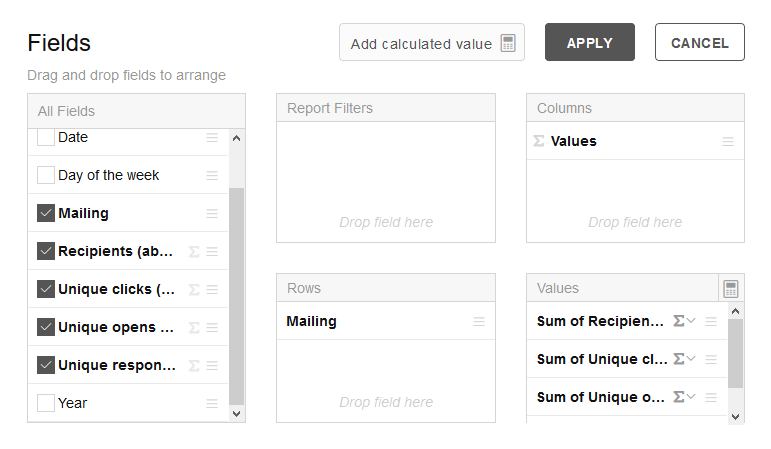
In the left Fields area, select the fields you want to use for the evaluation. You can drag and drop each field into one of the four areas. For the above example, click the measures Recipients, Unique clicks, Unique opens and Unique responses to add them as values to the Columns area.
Example 2: Analysis by time
To create a time-based analysis, deselect the Mailing grouping under Fields and drag the relevant time dimensions into the Columns field. Drag the Values into the Rows field.
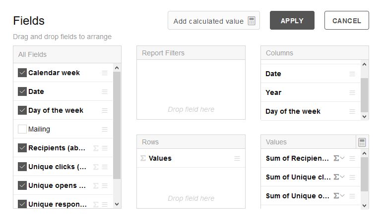
Click Apply, to create a new analysis:

Click the left arrow next to a field name to display the dimension organized below.

To change the hierarchy of these drop-down dimensions, drag one of the bold field filters in the upper area before or after other filters.
The example below shows Calendar week > Year > Date. By dragging the Year field filter to the far left, the year value will become top of the drop-down dimension hierarchy (green box).

Click the bold field filters to select and deselect fields or refine filters.
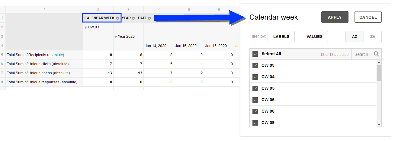
In the dialog box, click Filter by: Labels to specify conditions that are related to names. Example: Labels Contain newsletter filters field values with "newsletter" as part of their name. Click Filter by: Values to filter for numeric values. Example: Sum of Recipients Top 10 filters the 10 highest recipients field values. Click Apply to accept the changes.
To display your pivot table as a chart, click Charts in the menu in the upper left corner and select a suitable chart. Select the Multiple values checkbox to display multiple field values in one table. Use the Select Measures button to add or deselect individual measures.
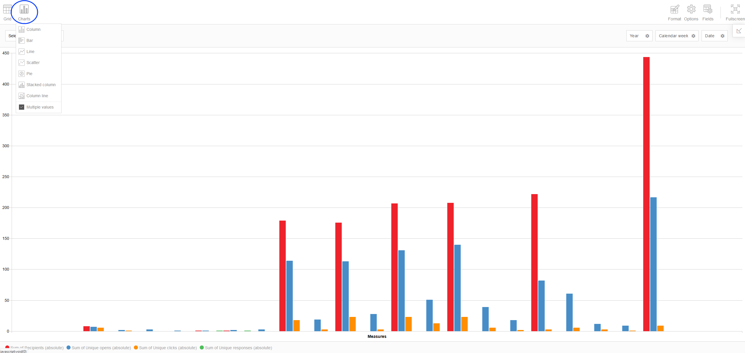
Click Grid to return to the grid view of the pivot table.
Further Menu options
Under Format in the top right menu, you can specify the formatting of individual cells or create conditional formatting.
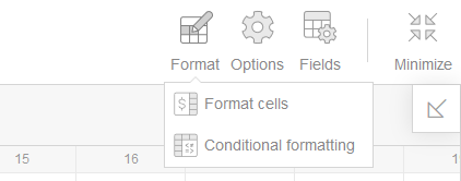
Click Format > Format cells to adjust the cell properties of all or some field values. You can, for example, add a currency symbol to some values of the table.
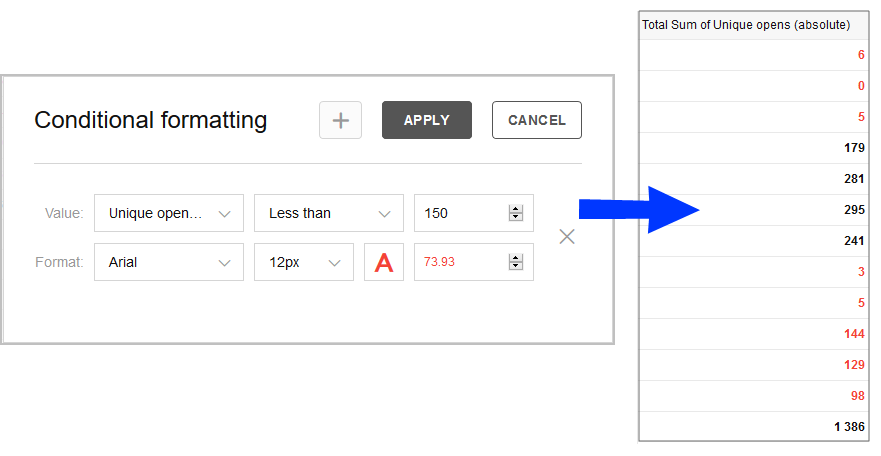
To add conditional formatting, select Format > Conditional formatting. Conditional formatting lets you, for example, configure that numbers below 150 are displayed in red.
Click Options in the upper right menu to change individual layout properties.
Please sign in to leave a comment.