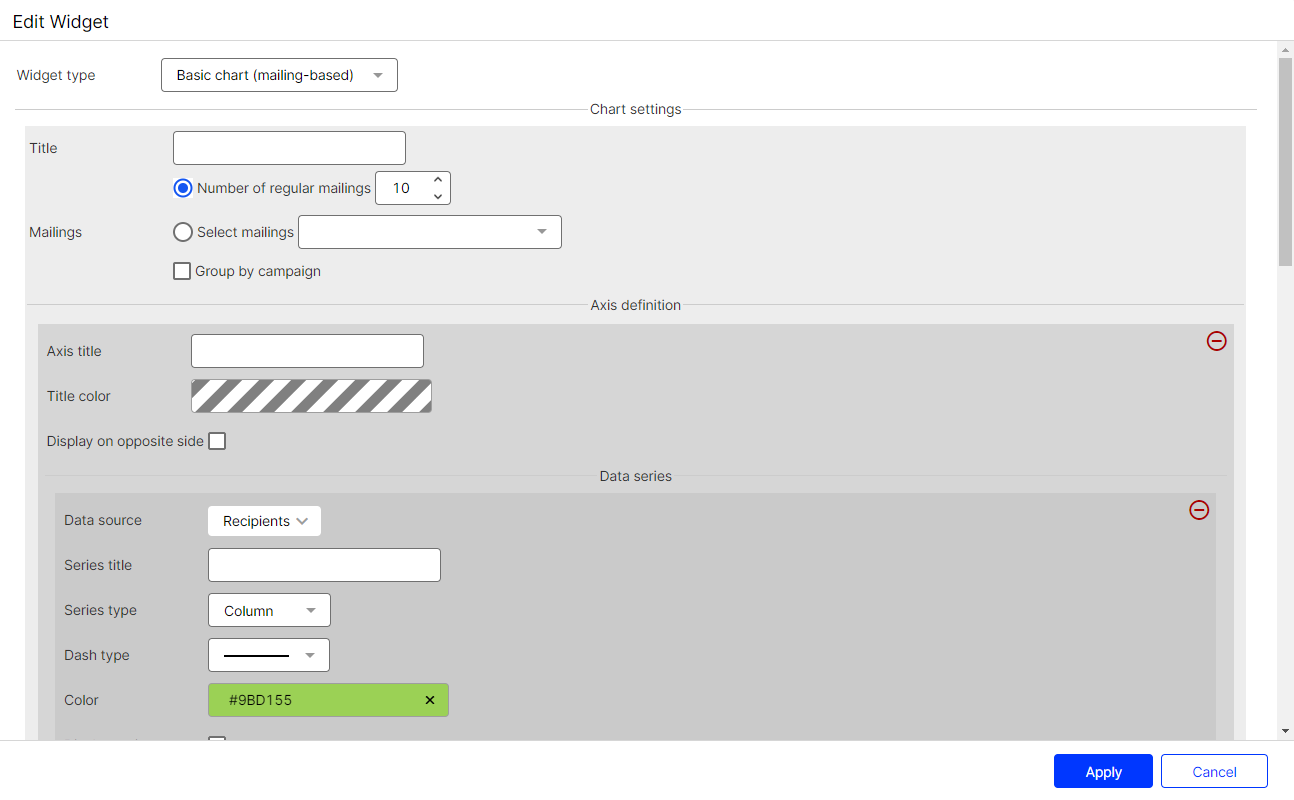
In edit mode, double-click a widget or hover over a widget and click Edit  .
.

You can make the following settings:
- Title. The title is displayed centered in a predefined font size. Leave the field blank if you do not want to display a title.
- Messages.
- Number of regular messages. Enter the number of most recently created regular messages that you want to display. Transactional messages, test messages, and confirmation messages are excluded.
- Select messages. Select one or more message drafts. You can select message drafts from transactional campaigns as well as regular message drafts.
- Group by campaign. Select the check box to group the evaluated messages according to the assigned campaign.
- Axis Definition.
- Axis title. Title of the Y-axis of the diagram. Leave the field blank if you do not want to display a title.
- Title color. Select a color for the axis title. Define the font color by entering a hexadecimal value preceded by
#(for example#000000). Alternatively, you can specify a color value using the color selector. - Display on opposite side. By default, the axis title is on the left side. Enable this option to display the axis title on the right side.
- Data source. Select the KPI you want to create a KPI chart for. The KPIs are absolute values and refer to the messages stored in your client.
- Recipients. Number of recipients to whom messages are sent.
- Opens. Opened messages.
- (absolute). Total number of opens.
- (unique). Total number of unique opens. Multiple opens by a recipient are seen as a unique open.
- (absolute) in %. Percentage of total opens in relation to the number of recipients.
- (unique) in %.Percentage of unique opens in relation to the number of recipients.
- Clicks. Clicked links.
- (absolute). Total number of clicks.
- (absolute) in %. Percentage of total clicks in relation to the number of recipients.
- (unique). Total number of unique recipients that clicked an arbitrary link in a mailing. It does not matter how often and which link was clicked.
- (unique) in %. Percentage of unique clicks in relation to the number of recipients.
- Bounces. Messages for which bounces have been registered, including soft and hard bounces.
- (absolute). Total number of bounces.
- (absolute) in %. Percentage of total bounces in relation to the number of recipients.
- (unique). Total number of unique bounces.
- (unique) in %. Percentage of unique bounces in relation to the number of recipients.
- Soft bounces. Messages for which soft bounces have been registered.
- (absolute). Total number of soft bounces.
- (unique). Total number of unique soft bounces.
- (absolute) in %. Percentage of total soft bounces in relation to the number of recipients.
- (unique) in %. Percentage of unique soft bounces in relation to the number of recipients.
- Hard bounces. Messages for which hard bounces have been registered.
- (absolute). Total number of hard bounces.
- (unique). Total number of unique hard bounces.
- (absolute) in %. Percentage of total hard bounces in relation to the number of recipients.
- (unique) in %. Percentage of unique hard bounces in relation to the number of recipients.
- Responses. Messages that return to the sending mail server (including reply, autoresponder, hard and soft bounce).
- (absolute). Total number of responses.
- (unique). Total number of unique responses.
- (absolute) in %. Percentage of total responses in relation to the number of recipients.
- (unique) in %. Percentage of unique responses in relation to the number of recipients.
- Unsubscribes. Registered unsubscribes.
- (absolute). Total number of unsubscribes.
- (unique). Total number of unique clicks on an unsubscribe link.
- (absolute) in %. Percentage of total unsubscribes in relation to the number of recipients.
- (unique) in %. Percentage of unique clicks on an unsubscribe link in relation to the number of recipients.
- Complaints (absolute) in %. Percentage of all spam complaints in relation to the number of recipients.
- Series title. Enter a significant name for the created chart.
- Series type. Select the display format of the chart.
- Area. Line chart with colored area.
- Area-Spline. Line chart with rounded corners and colored area.
- Column. Column chart.
- Line. Line chart.
- Spline. Line chart with rounded corners.
- Scatter. Values are displayed as separate points.
- Dash type. Select the desired dash type from the drop-down list.
- Color. Select a color for the displayed chart. Define the font color by entering a hexadecimal value preceded by
#(for example#000000). Alternatively, you can specify a color value using the color selector. - Display series. Disable this option to hide the graph. You can reactivate a hidden data series in the Performance Dashboard overview at any time.
- Add Data Series. Click Add Data Series… to add another graph.
- Add Axis Definition. Click Add axis Definition… to add another Y-axis to the graph. The scale of the new Y-axis depends on the data series you create under this axis definition.
Please sign in to leave a comment.